
To speak with a Recovering Addict call 619-584-1007 (San Diego County) or 442-456-1168 (Imperial County)
Para hablar con un adicto en recuperación, llame 619-546-0774

NA Flyer
Best Practices/Common Issues
Misspelled Words
Please use a spell-checker to check spelling & sentence structure. There is nothing worse than misspelled words or labeling something inaccurately.
Address Issues
Double-check the address. Is the zip code and location correct? Is it descriptive enough to find? Does it correctly resolve in a map app?
Background Too Busy
Try increasing the transparency or reducing the saturation of your background image to push the text to the front.
Hard to Read Text
The graphic rule is to limit fonts on a flyer to just two types. Having too many fonts is confusing to the reader. Fancy fonts that blend with the flyer theme should also be avoided unless they are one of the two fonts being used. The most important part of the flyer is understanding and comprehending what the event is, not how bitchin’ it looks.
QR Codes That Do Not Work
QR Codes should go to the exact location or page they refer to. All browsers can create a QR code from any webpage.
Our Primary Purpose
Please remember that getting the message to the addict who still suffers is more important than a design concept.
Narcotics Anonymous Logos Style Guidelines
View the NAWS guidelines concerning
the correct use of NA logos and symbols
Download PDF
NA Logo – Black over white background
Small: 100 x 100 – Size: 2.20 kb
Medium: 615 x 615 – Size: 15.59 kb
Large: 3000 x 3000 – Size: 109.38 kb
NA Logo – Blue or White – Transparent
Blue (Medium): 700 x 701 – Size: 14.6 kb
White (Large): 1814 x 1813 – Size: 47.8 kb
NA Service Symbol – Black over white background
Small: 100 x 100 – Size: 1.22 kb
Large: 3000 x 3000 – Size: 67.42 kb
NA Service Sunburst Logo
Small: 100 x 100 – Size: 2.20 kb
Large: 3000 x 3000 – Size: 109.38 kb
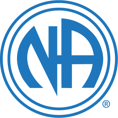
NA Logo Blue over white background
Small: 100 x 100 – Size: 2.20 kb
Large: 3000 x 3000 – Size: 109.38 kb
NA Service Symbol – Transparent
Blue: 698 x 698 – Size: 9.3 kb
White: 698 x 698 – Size: 9.3 kb